Showing posts with label decorative trim. Show all posts

12.06.2010

The Most Overlooked Room in the House

Readers of this blog know that I am rather obsessed with the traditional residential library.

I will also confess that I also love a good entry. I can't really say why this is so, but it may have something to do with all the hours that my brothers and I spent bump-bump-bumping down the stairs in some of the houses we grew up in, using our sleeping bags or (if we wanted to go really fast), using large pieces of cardboard.

My favorite entry hall no doubt was one we had in my later childhood. It was rather large, and had a window seat, two coat closets, a dumbwaiter (which had been closed up and turned into a telephone shelf), and room enough for a Christmas tree nestled in the crook of the staircase. The window seat was built over a radiator, so in the winter it was a great place to warm up. Pocket doors led to the dining room on one side, the living room opposite, and the back of the house beyond the stairs. The dado was faux painted by to resemble wood panels, by an Italian who was brought in by the 1938 home's original owner. And yes, a child could really slide down that railing. (I became quite good at it, thank you.)


One other thought has just occurred to me:  the image of Christopher Robin holding Pooh Bear's arm while Pooh bumped down the stairs.


But beyond these happy memories, I can't say why I am so focused on the entry. Unfortunately, too many homes in the past 25 years have featured cartoon versions of the entry. You know the type I mean: double height nightmares with a large ugly chandelier that have zero warmth and all the personality of a paper cup. 


I believe the most successful entries don't require an impressive height or a fancy stone floor, although there are many fine examples of both. The first thing I notice when entering a home is whether there is a sense of welcome. One should feel immediately at ease, no matter the style of the architecture or the size of the room. 


I also like to have a sense of the people who live in the home by observing the entry. This is the place that tells the world, "This is who we are."


Beyond this, I love entries that have lots of great detail. I look for a perfectly turned staircase, an elegant railing that ends in a beautifully crafted newel post. I wonder how many people think about the craftsmanship that goes into these features. There are bonus points for paneling, molding, and baseboards that not only add to the detailing but also serve to protect the walls from the bumps and scrapes that arise from endless comings and goings. I do like wallpaper in an entry, but I believe that you must be very careful in selecting this feature. I think most people choose a design that's undersized and a bit too twee. Really, if you're going for wallpaper in the entry, make sure that it is bold enough to announce your guests' arrival. I don't mean bold in a flashy way, but in a way that is scaled appropriately. I personally favor a painted wall in the entry instead.


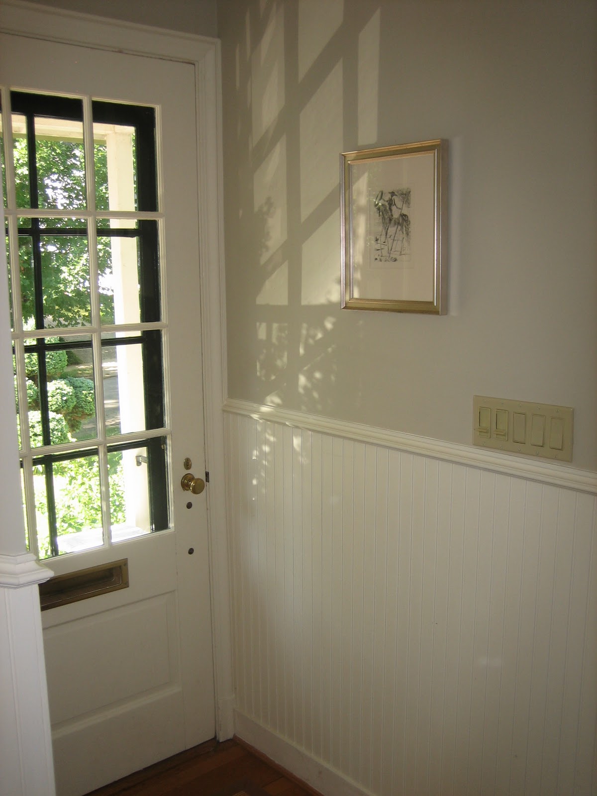
Our entry is modestly scaled, to say the least. It is only four inches wider than the front door and measures twelve feet long. As you can see from the image above, however, we've tried to do our best to make this a real room unto itself. It was deary, dark and about as unwelcoming as you can imagine when we bought our house seven years ago. It had a little bit of vinyl flooring right at the front door, so you wouldn't soil the lovely wall to wall carpeting that started in the entry and flowed up the stairs and also into the living room. 


The major change (apart from removing that vinyl and carpeting) was to add bead board for wainscoting.  It's not proper bead board strips, but rather Plybead, which is plywood that has been routed to appear like real bead board. Still, we're very pleased with the results. It has not only brought in light, but more importantly, a sense of place and arrival. It is no longer a dreary pass-through to the rest of the house. The upper wall is painted in Benjamin Moore's Grant Beige, while the wainscoting (and the trim throughout the house) is painted in White Cafe by Fine Paints of Europe. I selected Grant Beige because it suggests the stone tile slabs in some fine Georgian home that I wish I had.

One big challenge we did have was in finding a place (besides the stairs) where one could sit to remove shoes, or put down a purse, package, or backpack. There's absolutely no room in our 34 inch wide entry, so I "borrowed" space from the living room by placing a bench near the opening. This bench works so well that it is nearly always full of bike gear, mail and lots of shoes. I would say that this idea, in fact, has probably worked a little too well.


The result of all this obsession with the entry? Instead of wincing whenever I step through the front door, as I once did, I look forward to coming home each day.

I hope you've enjoyed the images, above, from some other fine examples of the entry. Just think of the stories that could start in these entries.

Image of Christopher Robin and Pooh Bear from Auggie.

6.23.2010

Living Room Redo

I opened this blog with a meditation on finding a loveseat that would be appropriate for the modest proportions of our living room. I tested an alternate furniture arrangement for a few months and kept hoping the time would be right to consider selling the existing sofa. But this moment never arrived; and besides, it turns out that the arrangement didn't work anyway.


There was a great seating arrangement around the fireplace, but the space behind the sofa was dead. The rug was only on temporary loan from our son, who had bought it for his dorm room. And we kind of had to let him have it back. (He has great taste in rugs, though, doesn't he?)

So, I moved the desk back into the dining room, placed the sofa between the windows again and thought about it some more. I concluded that the best recourse was to slipcover the sofa and make a couple of other small changes.

But how to do this on the smallest possible budget? Even 20 yards of inexpensive fabric can add up. And what color/type of fabric? 

Here is the list of changes I made to "finish" the living room:

1. Slipcover sofa
2. Purchase a decorative element to go on the wall over the sofa
3. Purchase a floor lamp to complement existing floor lamp on one side of the sofa, for reading
4. Paint the room a "better" shade of white

And here are the changes I made.

1. Use Ikea curtains for the slipcover fabric!

I decided to use blue and green as the main color theme for the first floor of our house. The living room wanted more blue in it, so blue it was. My choice was Ikea's Lenda curtains in light blue. It is a tough, fairly tightly woven chambray.


It has a subtle stripe woven in every six inches, which made cutting out the fabric and lining up seams a bit easier. I think I ended up purchasing 5 pairs of curtains at $25 per pair. And I have a bit less than two curtains' worth left, should I need to sew a replacement cushion cover or two. I started this in February, and stumbled along until I finished in May.

Next, I splurged on a decorative trim for the bottom hem. It is the popular Greek Key design, in pale blue and antique, from M&J Trimming.


Good so far. Finally, as the "pillow queen," as my husband calls me, I had to recover the current pair of throw pillows. I wanted something more current and saturated in color to punch up the dusky blue of the sofa. Calico Corner's Tala in Bluemarine from their Annie Selke collection fit the bill perfectly.


2. Use a round mirror

We've been in this house for seven years, and I still couldn't decide what I wanted to hang on the space above the sofa. It is typical to hang a piece of art designed to blend in with the color scheme; it is also dreadfully boring and predictable. Among other ideas, I considered framing a piece of wallpaper, hanging an old textile, doing a gallery-style collection of assorted smaller pieces, painting a mural, or just doing nothing. In the meantime, we tried two or three pieces we already owned. They all made me yawn. Then it struck me that we needed something round. There are already so many squares and rectangles in the room. A round object, specifically a mirror, would liven up the somewhat plain jane furnishings. This one from Ballard Designs not only meets my requirements, it was affordable:


3. Find an affordable floor lamp that complements the other four in the room, none of which match.

This was easy. I found it on the Circa Lighting website, on sale. Nuff said.


4. Find the right white

Sigh. This was the most difficult part. I ended up taking home large samples from my firm's Benjamin Moore professional catalogue of BM colors. I considered Acadia White, Navajo White, Lancaster Whitewash, and White Dove. I chose Lancaster Whitewash, which wasn't too pink or yellow, but more of a very pale warm cement. Warm cement doesn't sound very nice. But really, it makes a great wall color.

Next post:  the results!