Showing posts with label mantel. Show all posts

12.20.2011

Warm White Christmas

White, parchment, linen, stone, snow, cream, limewash, ivory, milk, chalk, natural, cotton, khaki, greige, plaster, buff, ice, taupe, alabaster, cloud.

Winter is the ideal time to explore white and all of its neutral cousins.

Start with the most comfortable seating, perfect for reading by the fire and eating popcorn.


George Sherlock Two-Seater sofa


Add some birch logs, or at least have them artfully arranged near the fireplace. They're pretty expensive, and you may be reluctant to burn them!


Birch logs


Decorate your mantel in soothing whites, evoking nature's winter beauty.


David Stark for West Elm topiary tree


Add a few funky handmade trees to your mantel-top forest.


Bottle Brush trees from West Elm


Ice the front of the mantel with this handmade paper garland.

Handmade paper bunting from Toast


Soften the room with frothy white hydrangeas, also a fresh reminder of warmer days to come.

White mophead hydrangea from Terrain

As you sit by the fire, wrap your gifts in plain white paper and finish them off with these tags. Your lucky friends can plant the tags - they're seeded!
Seeded Snowflake tags from Terrain


When it's time for bed, retreat to a cosy warm bed in a white bedroom. Don't forget your hot water bottle!


Master bedroom from Coastal Living

11.20.2010

Another Black Mantel


From this month's Elle Decor, another lovely black mantel. This vibrant living room was created by architect Gil Shafer, AIA, and interior designer Miles Redd. This example shows that the black mantel sets off saturated colors just as well as more neutral colors. And the Sultanabad rug is exquisite.

7.18.2010

Dark Mantel, Again


Yes, I'm still thinking about it. This is a really nice example. It is a Christopher Maya living room from the February 2009 issue of House Beautiful. The paint is Benjamin Moore Black Panther in a gloss finish. This shows how great black works with light blue and red, which of course are the colors of my sofa and rug. I also like the black echoed in the large coffee table.

It really would add a nice bit of drama and finish to our living room. Dum de dum de dum. Need some more time to think about it.


(And yes, I did switch the lamps on either side of the fireplace!)

Check out another nice example, this time from Lonny. Note the light blue chair and sofa, with a peek at a red pillow. Definitely a pattern there!

Photo 1: Julian Wass; Photo 2: Lexy Mueller


7.11.2010

Pulling It All Together

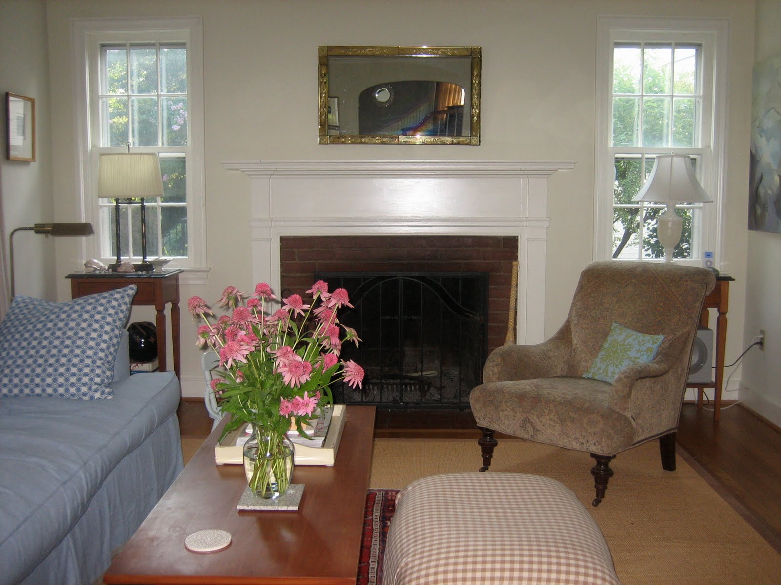
Overall, the mini-makeover of the living room has been a great success. The blues of the slipcover and pillows have injected just enough color to balance the green of the dining room. As you can see from the image below, however, there is a lot of reddish brown in the leather chair, coffee table, the tables flanking the fireplace and the cabinet (not shown) to the left of the sofa. I really want to do something about that. My current thought is to "knock down" the finish of the coffee table by sanding off the stain and leaving it with a weathered, or perhaps a light gray-stained finish.


The main slipcover is not piped; however, the seat and back cushions are piped to give them a better hold on their shape. Note the trim on the hem. In addition to giving the unlined slipcover some heft, it also gave it a bit more presence.


The blue and white cushions work perfectly with the existing Pottery Barn embroidered cushions here ....


.... and here. The mix of different shades of blue keeps it all from fading out, which could have been an issue with light blue in a south facing room. And the green embroidery (above) picks up on the green of the dining room and the bobble trim on the curtain panels.


The barely-there floor lamp fits right in. You could use this almost anywhere.


The opposite side of the room looking into the entry hall, and the study/guest room beyond. You can see the problems I'm having with the flash on the camera. Still trying to work on that.


A view of the glass door cabinet, with Robert Marx's illustrations for "The Wretch," by Guy de Maupassant, above it. We bought the prints from the Franz Bader Gallery in D.C. in the mid-eighties and gradually framed eight of them. The "Cycles Lea" poster to the left was purchased and framed for us a couple of years ago. The bench below it is from Ballard Designs; the black and white box below the Marx prints is from Wisteria.


Another view of the entry. The round bone mirror is from Anthropologie.


Another Robert Marx print, "The Little Bishop," in the corner. Notice that the mantel is still white. I decided to hold off on painting it black until I resolve some of the other design decisions in the room. I'm still thinking about it.


It took a few tries to figure out which of our rugs would work best under the coffee table. Turns out this little runner was the best choice.


Claire made the "babies" during her first year at MICA. I just love them.


The Ikea cabinet, used to hold dishes in the dining room of our first house. It was knotty pine; I painted it as soon as we moved to this house seven years ago. It now holds books, tablecloths and knick knacks inside (where else should knick knacks go?); on top is my little collection of matte white McCoy pottery, a blue stoneware plate from my husband's bachelor days, a pretty candleholder from his family's collection of German antiques, a delft tile from our trip to Amsterdam in 2001, a pewter pitcher, and a lonely landscape that we bought from the Seaside Art Gallery in North Carolina's Outer Banks in the early1990s. It all works nicely together, don't you think? The spotlight, from Pottery Barn, is focused on the Cycles Lea poster. Some day I'd still like to install a real picture light above the poster.


A Venetian mirror from my mother. It's actually lying on its side. The top part of it is hanging upstairs in our bedroom.


A view of the stair brackets in the entry. One of the very few genuine architectural details in the house.


We added the wainscotting, seen below, four years ago. I still hope to continue it through the dining room and up the stairs to the second floor (hint, hint).


A pot from Claire's high school pottery class days, and some of my design library (plus Miss Potter).


I bring the seashells out each summer.


Another view of the finished room. With this, the first floor is now well on its way to completion. Of course, I'm never really finished. 


8.15.2009

Dark Mantel

There has to be some sort of compensation for putting up with Washington-area traffic, cost of living, and humidity.

Indeed there is, for any time you have a few hours you can head down to the National Gallery of Art. It is simply one of the finest museum experiences you are liable to find anywhere, just for the sheer beauty of the buildings, if not the magnificent art. This is exactly what we did last weekend.

We are trying to enjoy the last days of summer before we pack off our younger child to college. He, being an eager photographer, suggested the trip. And the first gallery we visited was the Small French Paintings, located in the East Building's lower level.

Donated by Ailsa Mellon Bruce, this collection is one of our family's favorites.

The painting that really caught my eye on this visit is Edouard Vuillard's Vase of Flowers on a Mantelpiece, c. 1900.


What a fantastic idea! I started picturing our mantel painted black. Now that would really pull together the new seating arrangement, giving our modest living room an undeniable focal point. It would also give a bit of edge to a room filled with furniture that is either painted off-white or just medium brown wood. And what about that bit of greeny blue in the mirror's reflection? I've been thinking of using that as the fabric color for the eventual new loveseat. I also love the touch of green on the crown molding. This echos the green of our adjacent dining room.

Although it has a late Victorian look to it, the painting and the room have a distinctly lighter French feel.

The only question is, would the mantel look best in a glossy or eggshell finish?

Vuillard liked to include at least one prominent dark object in many of his works. Here's a pastel entitled Madame Josse Hessel in Vuillard's Studio from 1915.


Many of the same colors are used in this painting. There's the overall softness of the pinky beige walls and blue door sharpened by the dark seated figure on the left and the artist's shelves on the right. And again a touch of green through the doorway and above the shelves.

I think I see a pattern developing here for my ongoing pursuit of living room decoration.

Vase of Flowers courtesy of the National Gallery of Art; Madame Hessel courtesy of The Athenaeum.