12.20.2011

Warm White Christmas

White, parchment, linen, stone, snow, cream, limewash, ivory, milk, chalk, natural, cotton, khaki, greige, plaster, buff, ice, taupe, alabaster, cloud.

Winter is the ideal time to explore white and all of its neutral cousins.

Start with the most comfortable seating, perfect for reading by the fire and eating popcorn.


George Sherlock Two-Seater sofa


Add some birch logs, or at least have them artfully arranged near the fireplace. They're pretty expensive, and you may be reluctant to burn them!


Birch logs


Decorate your mantel in soothing whites, evoking nature's winter beauty.


David Stark for West Elm topiary tree


Add a few funky handmade trees to your mantel-top forest.


Bottle Brush trees from West Elm


Ice the front of the mantel with this handmade paper garland.

Handmade paper bunting from Toast


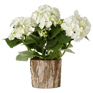
Soften the room with frothy white hydrangeas, also a fresh reminder of warmer days to come.

White mophead hydrangea from Terrain

As you sit by the fire, wrap your gifts in plain white paper and finish them off with these tags. Your lucky friends can plant the tags - they're seeded!
Seeded Snowflake tags from Terrain


When it's time for bed, retreat to a cosy warm bed in a white bedroom. Don't forget your hot water bottle!


Master bedroom from Coastal Living

10.13.2011

Top Ten Design Features

What defines style today?

For your consideration, here is my Top Ten selection of features that have most inspired designers and consumers in the past five years or so. Although I could name several more, these are at the top of my list.

Today's designers now have an endless sourcebook for inspiration online. How did they figure this stuff out 10 or 15 years ago? Who knows?

1. Books/bookshelves.

Even in pared down, contemporary spaces, bookshelves are everywhere nowadays. I must list this feature first, of course!

Phillip Gorrivan living room

2. Gallery-style wall art collections.

Our definition of 'art' has matured. Favorite photos, drawings, found objects, flea market portraits and kids' art can all find space on the wall.

Kate and Andy Spade's NYC entry

3. Muscular design details.

Bold features are evident everywhere; delicate features are used only sparingly and to much greater effect. More often than not, furnishings and accessories are sculptural, even sensual.

Ruby Beets

4. Dark/light contrasts.

Black and gray have had a surprisingly long-lived moment. When combined with white, they add spark and (shock!) actually open up and brighten a space.

Thom Filicia showhouse bedroom

5. Continued emphasis on solids, tone-on-tone and geometric patterns.

Not the 90s variety of beige tones, but using contrasts (see No. 4) to add depth and graphic interest. Yes, I know florals are the next big thing on the horizon. But I expect to see those designs complementing or even accenting, rather than dominating a scheme, even in traditional interiors.

House and Home

6. Saturated colors.

Neutrals will always have their place, but when colors are used, they are vibrant and bold (and check out the black mantel).

Miles Redd

7. Luxury surfaces.

The selection of quality tile, stone, floor coverings, textiles, fixtures and paints has exploded recently. I suspect this is a result of research and development improvements in materials, improvements in manufacturing techniques, and access to a wider variety of natural materials. It also seems to me that pigments are far more various and of a higher quality. Generally speaking, today's consumers expect a much greater variety of options, courtesy of their iPad and laptop.

Ann Sacks Nottingham tile

8. Comfortable does not equal messy.

Today's furnishings and textiles are sturdy and have comfort built into them, so there is no excuse for oversized, frumpy sofas and chairs (or messy beds).

Michael Smith bedroom

9. Pared down window treatments.

Even in traditional interiors, consumers want a clean, light-enhancing view out of their windows. Fussy is out. Period.

Robert Courterier's country dining room

10. Recycled materials.

Found, repurposed, and handed down. Recycling furnishings and accessories is the easiest way to go green in your home.

Living Etc.

Which design features would you add to this list? Please let me know!

Dining Room Reno, Part 3: Renaissance

At long last, the final installment on our dining room transformation. After half a year of use, it is remarkable how much more we use this room. It serves as a study, office, breakfast room and of course, dining room, every day. Adding the wainscoting also lightened up this formerly dark space. 


Still on the punchlist:  install that shoe mold, already!


The "bump outs"also added dimension to the space while taking up very little extra footage.


The sisal rug from Home Decorators matches the rugs in the living room and entry. Pulling these elements together has helped to open up the entire first floor.


Still lots of space when we add the extra leaf to the table.


Lighting in the room is more balanced with the addition of the picture lights. I wish I could say the same about my picture-taking ability!


Tying in the wainscoting from the entry, through the kitchen and into the dining room gives the sense of one larger space, even though they are separate rooms. 

To sum:  We upgraded the HVAC and breathed life into a dark and underused space. Best of all, we visually tied together all of the rooms on the first floor, and we've done it with minimal structural changes. We like the basic size and layout of our house - no need to add on or tear down walls. 

10.11.2011

Apology

There appear to be technical difficulties with this blog. I hope to have the problem fixed soon - stay tuned!

9.10.2011

Dining Room Reno, Part 2: Time to Rebuild


The backstory:  We needed to upgrade the HVAC, which entailed installation of a large duct from the basement through the dining room and up to the second floor. This presented new design opportunities for the room, allowing us to create a dining room cum library and study.


Our initial goal was to install floor to ceiling bookcases flanking the window. Yet after sketching it out on paper, it somehow didn't seem right. The bookcases would be quite narrow, given how large the return ended up. So we opted for a low bookcase that skims the bottom of the window. In fact, the top of the new case replaces the window sill, making the unit look nice and tidy. We also looked at the dismal old window and decided to replace it.

Notice the boxes for the new wall sconces to the side of the window. Rebuilding the wall gave us an opportunity to add more lighting to the room, which faces north.


This also gave us the opportunity to extend the wainscoting from the entry and kitchen into the dining room, as we had planned for a few years. Finally, we could insulate the "new" wall behind the sheetrock (with an extra piece behind the bookcase, for good measure), which we've tried to do in all of our renovation projects in the house. Although the brick holds a lot of heat, even on sunny winter days, the house was built uninsulated. Brrrrrr.


Here's the matching "fake" chase on the other side of the window.


Here we fitted in the pieces of wainscoting. We used Georgia Pacific's Plybead, rather than genuine beadboard. We chose this because it was easy to install on top of the existing baseboard. The downside: each of these puzzle pieces required priming on all six sides (including the back and edges) to prevent them from warping over time. The prepping, priming and painting involved with these pieces probably took longer than any other step in this entire project.

Christmas came and went, as we waited for the new window to be delivered. Then in March of this year, we started up again, installing the new window, trim and the last pieces of wainscoting around the window and bookcase.

Next:  Dining Room Reno, Part 3: Renaissance
Previous:  Duct and Cover

Making the Rounds

Here's a brilliant freestanding bookshelf from Anthropologie. I'm sure this isn't the first round shelf unit ever (I'm thinking 1980s Memphis), but this iron and mango wood beauty is light and sculptural.

9.09.2011

More Books in the Dining Room


Here's one more beautiful example of freestanding bookshelves (in the dining room!), this time from Alessandra Branca, by way of House and Home. The shelves are simple enough; the wallpaper's giant paisley gets all the visual attention, along with the red upholstered chairs.

One item I forgot to mention in my post on freestanding bookshelves:  they must be secured to the walls, especially if you have kids running around. I would say this is important even in areas that are not traditionally prone to earthquakes, as we now know!

9.07.2011

Dining Room Reno, Part 1: Duct and Cover

It began as an idea.

How could we affordably manage to upgrade our HVAC system and deal with the resulting alterations to our dining room, living room, master bedroom and daughter's bedroom? The answer turned out to be relatively easy to design, but difficult to execute.

Our heating and air conditioning layout, for the most part, was as old as the 1940 house. Like most systems installed during that era, the returns were not designed to adequately handle the supply airflow, resulting in a poorly balanced system that barely heated and cooled the first floor. Forget the second floor.

Our HVAC savior proposed installing a new mega-return from the basement through the dining room, and on up to the blog daughter's bedroom. Great, we thought. Now how do we deal with this ugly metal box in the corner of these rooms?

This was just the excuse we needed to integrate the new chase with a built-in bookcase. Yes, friends, the bookcase dreams could potentially become a reality. Although the end result is not what we initially intended to build, it turned out to be exactly the right solution for our space, and we couldn't be happier.

The story started nearly a year ago. The first weekend of October 2010 in suburban Washington, DC was especially mild and lovely. We should have been outdoors enjoying ourselves. Yet what were we doing? Demo, baby! It was a down and dirty, noisy, painful dust-up. And at the end of the weekend, we succeeded in prepping the spaces for the contractor to come in and begin installation of the new system.


Cutting up the floor and gouging out holes in the wall is really quite scary. But we forged ahead and finished the demo on time.


Fast forward to November. The new ducting and equipment were installed. Now we had to start the hard part:  putting it all back together.

Next time:  Time to Rebuild

8.28.2011

My Favorite Room, Part 3: Free Standing Bookshelves

Judging by the popularity of my posts on bookcases and libraries (here and here), there are clearly a lot of bookcase enthusiasts out there. While I fantasize about bespoke custom built-ins with yards of moldings, mounted brass library lights, and artfully placed bibelots among the stacks of weighty books, it's obvious that I (and probably most of you) don't have a sufficiently large budget or carpentry skills to make this a reality. Of course, it helps to be married to someone who does have carpentry skills, but that's another post.

The inspiration for this post is the soaring San Francisco dining room of designer Steven Volpe, which just so happens to be the cover for the September 2011 issue of Elle Decor.


This example shows the versatility of free-standing bookcases. It also points out the fact that you don't necessarily want to build in shelving if the conditions can't accommodate it. In this case, the metal shelves from Martin Szekely fit beautifully between the rough-hewn pilasters and play off the vibe of the vintage chairs and modern custom table with metal legs.

Bookcases don't necessary have to stand on the floor to function well and look beautiful.


This example from Virginia McDonald in House and Home has the same vintage modern aesthetic as the Volpe room, above. But without the soaring vertical proportions, the wall-mounted horizontal shelving makes a lovely sculptural statement in addition to handy storage for books, without interrupting the clean lines of the fireplace.

Sometimes, however, you just want a wall of books. The boxy cubbies formed by these store-bought bookcases in a room by Tracy Garret Design, also shown in House and Home, offer lots of opportunities for displaying a variety of objects alongside books of various sizes. The repetition of the openings makes it look orderly rather than a haphazard jumble.


Many types of case goods accommodate books. I think it's time to resurrect the poor TV armoire, this time as a cabinet for books, wine, table linens, or what have you. These examples from Rue magazine show creative use of vintage cabinets that could be picked up at just about any corner antique or consignment shop.


If you don't want to go the vintage route, and instead opt for something sleeker and more modern, here are some low and high (budget-wise) retail versions of free-standing bookcases that could be useful in many spaces.


Ikea's Stockholm bookcase comes with a black-stained oak veneer and oak solids, and has more heft and styling than their usual model. It also has been designed with an add-on left or right unit that cleverly attaches so that you don't get a double side rail, giving it a custom look. I love the simple finish on this unit, but you could also personalize the finish. Paint the back before you install it for a punch of color. Wallpaper and stenciling also work, but remember that designs will be partially covered up by your books and objets.


West Elm's Flat-Bar Bookcase coordinates with a desk, storage desk and printer caddy in graphite/barley or chocolate finishes. I think these would look best on their own, rather than placed side-by-side, but they would work great as a pair flanking a window, doorway or fireplace, as you see here. Again, home design these days is all about versatility, and you could make a terrific living space cum library/office with these because they won't overwhelm the room but clearly will hold a boatload of stuff. They are also deep (15"), and therefore don't suffer the problem that lots of mass-market shelving does; mainly, meaner proportions that result in a cheap appearance.

Finally, let's take a look at two more modern classic "off the shelf," um, versions for your consideration.


This is Blu Dot's Chicago 8 Box Bookshelf Storage Unit, available from Velocity Art & Design in maple, graphite-on-oak or cherry (example shown above). What's great about this piece is that you can use the tops of the alternating boxes for display such as flowers, sculpture or even a nifty bar. I also like the way the open spaces give a bit of breathing room. 


I've saved the best for last. The Herman Miller Eames Storage Unit, also from Velocity, is one of the earliest examples of a modern free-standing bookcase and is notable for its rich variety of colors, textures and materials. While it is usually thought of as piece for the office, this could just as easily work in a dining room, living room or library on its own or with the two smaller versions shown below. It also comes in a more colorful version, but I'm partial to the soft natural finishes shown here.


I hope these examples inspire you to look beyond the custom built-in ideal, even if you really can afford the design and construction of a traditional English library. Even die-hard Kindle owners must surely acknowledge the obsession with a beautifully displayed book collection. 

How do you display your books? Let me know!

8.23.2011

Erdbeben!

Pretty exciting day in the nation's capital today. I was in the bathroom in my office when the quake started. Most of us thought the contractors installing the new boiler on the roof of our building dropped a heavy piece of equipment. Or maybe it was just the Red Line train running by (our office is right over the metro tracks).

We did sustain some seismic damage here in the Sawrey Village, although to be honest, it wasn't terribly dramatic. Our front steps were cracked in two places, along the seams where the sections meet.


A few things on my desk were knocked over.


The biggest casualty seems to be our daughter's cat. Tyler fled to the basement during the quake, and except for a brief, stealthy reconnaissance mission upstairs to view the [potential] damage, he bolted for the basement again. He sits there still, six hours later. People, he has not eaten dinner yet tonight. Clearly, something is terribly wrong. Maybe he knows something we don't? More to come?


ETA, 25 August 2011:  The Washington Post has an article this morning about the reactions of many animals at the National Zoo moments before, during, and after the earthquake. "Zoo mystery:  how did apes and birds know quake was coming?"