Readers of this blog know that I am rather obsessed with the traditional residential library.
I will also confess that I also love a good entry. I can't really say why this is so, but it may have something to do with all the hours that my brothers and I spent bump-bump-bumping down the stairs in some of the houses we grew up in, using our sleeping bags or (if we wanted to go really fast), using large pieces of cardboard.
My favorite entry hall no doubt was one we had in my later childhood. It was rather large, and had a window seat, two coat closets, a dumbwaiter (which had been closed up and turned into a telephone shelf), and room enough for a Christmas tree nestled in the crook of the staircase. The window seat was built over a radiator, so in the winter it was a great place to warm up. Pocket doors led to the dining room on one side, the living room opposite, and the back of the house beyond the stairs. The dado was faux painted by to resemble wood panels, by an Italian who was brought in by the 1938 home's original owner. And yes, a child could really slide down that railing. (I became quite good at it, thank you.)
One other thought has just occurred to me: the image of Christopher Robin holding Pooh Bear's arm while Pooh bumped down the stairs.
But beyond these happy memories, I can't say why I am so focused on the entry. Unfortunately, too many homes in the past 25 years have featured cartoon versions of the entry. You know the type I mean: double height nightmares with a large ugly chandelier that have zero warmth and all the personality of a paper cup.
I believe the most successful entries don't require an impressive height or a fancy stone floor, although there are many fine examples of both. The first thing I notice when entering a home is whether there is a sense of welcome. One should feel immediately at ease, no matter the style of the architecture or the size of the room.
I also like to have a sense of the people who live in the home by observing the entry. This is the place that tells the world, "This is who we are."
Beyond this, I love entries that have lots of great detail. I look for a perfectly turned staircase, an elegant railing that ends in a beautifully crafted newel post. I wonder how many people think about the craftsmanship that goes into these features. There are bonus points for paneling, molding, and baseboards that not only add to the detailing but also serve to protect the walls from the bumps and scrapes that arise from endless comings and goings. I do like wallpaper in an entry, but I believe that you must be very careful in selecting this feature. I think most people choose a design that's undersized and a bit too twee. Really, if you're going for wallpaper in the entry, make sure that it is bold enough to announce your guests' arrival. I don't mean bold in a flashy way, but in a way that is scaled appropriately. I personally favor a painted wall in the entry instead.
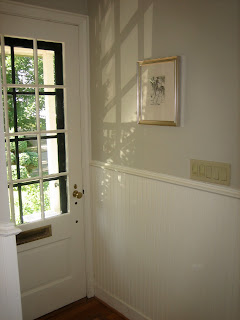
Our entry is modestly scaled, to say the least. It is only four inches wider than the front door and measures twelve feet long. As you can see from the image above, however, we've tried to do our best to make this a real room unto itself. It was deary, dark and about as unwelcoming as you can imagine when we bought our house seven years ago. It had a little bit of vinyl flooring right at the front door, so you wouldn't soil the lovely wall to wall carpeting that started in the entry and flowed up the stairs and also into the living room.
The major change (apart from removing that vinyl and carpeting) was to add bead board for wainscoting. It's not proper bead board strips, but rather Plybead, which is plywood that has been routed to appear like real bead board. Still, we're very pleased with the results. It has not only brought in light, but more importantly, a sense of place and arrival. It is no longer a dreary pass-through to the rest of the house. The upper wall is painted in Benjamin Moore's Grant Beige, while the wainscoting (and the trim throughout the house) is painted in White Cafe by Fine Paints of Europe. I selected Grant Beige because it suggests the stone tile slabs in some fine Georgian home that I wish I had.
I hope you've enjoyed the images, above, from some other fine examples of the entry. Just think of the stories that could start in these entries.
Image of Christopher Robin and Pooh Bear from Auggie.


No comments:
Post a Comment
Thanks for your comments.