8.30.2009

My Favorite Room


I may as well make it very clear early on in this venture that my favorite room in a house is a library. Notice that I say "a house," and not, "my house," because I don't have a library. Not yet, anyway. But in the meantime I can dream about a classic English library.


The image, above, is a good example. Note the floor to ceiling built-in shelves with discreet lighting fixed to light the books. The shelves are deliberately, but not too perfectly arranged, with some titles lying on their sides (these were probably too tall otherwise). A few well-chosen objets are mixed in to break up the monotony of rows of books. A leather chair is practically a requirement for a classic library, preferably worn and slightly beaten. Finally, strong colors should predominate in my fantasy library. This doesn't mean dark, gloomy, tobacco stained walls and the crepuscular glow of oil lamps. As shown above, a library can still benefit from a fair amount of natural light.


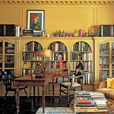
The deep mustard color of these shelves makes my mouth water! Note that these shelves don't reach the ceiling. Instead, molding details and a very pretty scalloped crown continue above. The resulting bookshelf top has allowed the owners to display a jumbled collection - and not surprisingly, more books - including a pretty portrait with blue and red that contrasts beautifully with the yellow woodwork. I also like the way these shelves start about a foot from the ground. These shelves are easy to reach, and therefore must be very easy to use. Note also the arches, which break up the horizontal lines, and the chicken-wire screens used on pairs of arched doors. I could easily meditate in this room for hours, without even picking up a book.

Other essential ingredients for my library: A variety of quirky Edwardian upholstered furniture (see my post on loveseats for some examples), plenty of good reading lights at each chair and sofa, small tables dotted around for drinks and my laptop, a well worn oriental rug, a few simple flowers (not too fancy, or if they are then just one or two sitting in a small vase or cup), a couple of antique occasional chairs, at least a little bit of velvet or embroidery in the textiles. And lots of art work, in different styles, sizes and heights on every wall, with appropriate picture lighting, and perhaps even hanging from some of the shelves themselves.

It should all be organized, but still haphazard. Does that even make sense?

What I don't like: Heavy drawing room curtains. These would just feel too oppressive. Not to mention they would be gigantic and expensive dust, pollen and odor collectors. Simple straight panels to keep the room balanced and keep out the drafts, combined with shades if necessary, are fine, thank you.

In At Home with Books: How Book Lovers Live with and Care for Their Libraries, authors Estelle Ellis and Caroline Seebohm and photographer Christopher Simon Sykes capture many examples of real-life libraries that inspire my fantasy. As to why I and others find these rooms so captivating, the authors write in their introduction:

Book-centered rooms are described as nurturing, a comfort zone, an
escape hatch, a place to retreat to for tea and talk, thinking and
reading, recapturing memories, regenerating spirit and ideas.

Some other inspirational titles: The English Room, by Chippy Irvine and photos also by Mr. Sykes; Perfect English, by Ros Byam Shaw; and Domestic Art: Curated Interiors by Holly Moore, Rob Brinkley, and Laurann Claridge. There are lots of other great examples; these are just a few of my favorites.

I'll leave you with a few more images. These are updated, lighter versions that would work well in the average home. The first two are from Domino:


8.25.2009

Seasonal Walk

For me, no trip to New York would be complete without a visit to the New York Botanical Garden. It is so easy to get to by subway or car, that there is no excuse not to visit this beautiful refuge in the Bronx.

Right now, my idea of Paradise would be to live in this garden, the Seasonal Walk, created by two of the most talented garden designers now in practice, Piet Oudolf and Jacqueline van der Kloet. These Dutch designers are first and foremost plant-centric. They both build on a solid foundation of design, but their priority is the plants. Piet is a well-known proponent of perennials in the Dutch "new wave" movement; Jacqueline is the bulb specialist. Their program was to create a four-season border alongside the NYBG's Enid A. Haupt Conservatory. Imagine having two huge borders - one 186 feet and the other 86 feet long - to plan, plant, and nurture!
The project has been so successful that the NYBG has extended the show for an additional year, through 2010. Even if you won't be able to enjoy the garden in person, the Seasonal Walk Chronicles are well worth repeated visits online. Garden writer Tovah Martin and photographer Rob Cardillo have created a terrific diary of the garden's development. It's a must-read for any of us interested in learning the secrets of the Dutch dynamic duo who have previously collaborated on two projects, both in the US: Battery Park in New York and the Millennium Park in Chicago.
I can't wait to visit this special place again; perhaps this fall. Stay tuned! I hope to bring you some of my own photos of the Seasonal Walk myself.
In the meantime, here is a sample of beautiful photos taken by my very talented son Peter during our trip to the NYBG two summers ago.


All photos copyright 2009 by Peter M. Mueller.

8.15.2009

Dark Mantel

There has to be some sort of compensation for putting up with Washington-area traffic, cost of living, and humidity.

Indeed there is, for any time you have a few hours you can head down to the National Gallery of Art. It is simply one of the finest museum experiences you are liable to find anywhere, just for the sheer beauty of the buildings, if not the magnificent art. This is exactly what we did last weekend.

We are trying to enjoy the last days of summer before we pack off our younger child to college. He, being an eager photographer, suggested the trip. And the first gallery we visited was the Small French Paintings, located in the East Building's lower level.

Donated by Ailsa Mellon Bruce, this collection is one of our family's favorites.

The painting that really caught my eye on this visit is Edouard Vuillard's Vase of Flowers on a Mantelpiece, c. 1900.


What a fantastic idea! I started picturing our mantel painted black. Now that would really pull together the new seating arrangement, giving our modest living room an undeniable focal point. It would also give a bit of edge to a room filled with furniture that is either painted off-white or just medium brown wood. And what about that bit of greeny blue in the mirror's reflection? I've been thinking of using that as the fabric color for the eventual new loveseat. I also love the touch of green on the crown molding. This echos the green of our adjacent dining room.

Although it has a late Victorian look to it, the painting and the room have a distinctly lighter French feel.

The only question is, would the mantel look best in a glossy or eggshell finish?

Vuillard liked to include at least one prominent dark object in many of his works. Here's a pastel entitled Madame Josse Hessel in Vuillard's Studio from 1915.


Many of the same colors are used in this painting. There's the overall softness of the pinky beige walls and blue door sharpened by the dark seated figure on the left and the artist's shelves on the right. And again a touch of green through the doorway and above the shelves.

I think I see a pattern developing here for my ongoing pursuit of living room decoration.

Vase of Flowers courtesy of the National Gallery of Art; Madame Hessel courtesy of The Athenaeum.